

Style and brand
Evolve components set no brand colors, radii or sizes of their own. They read design tokens: CSS custom properties that your brand stylesheet defines. Change a token and every component that reads it follows, across all feature packages.
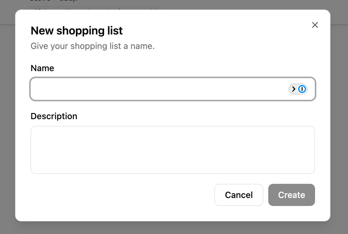
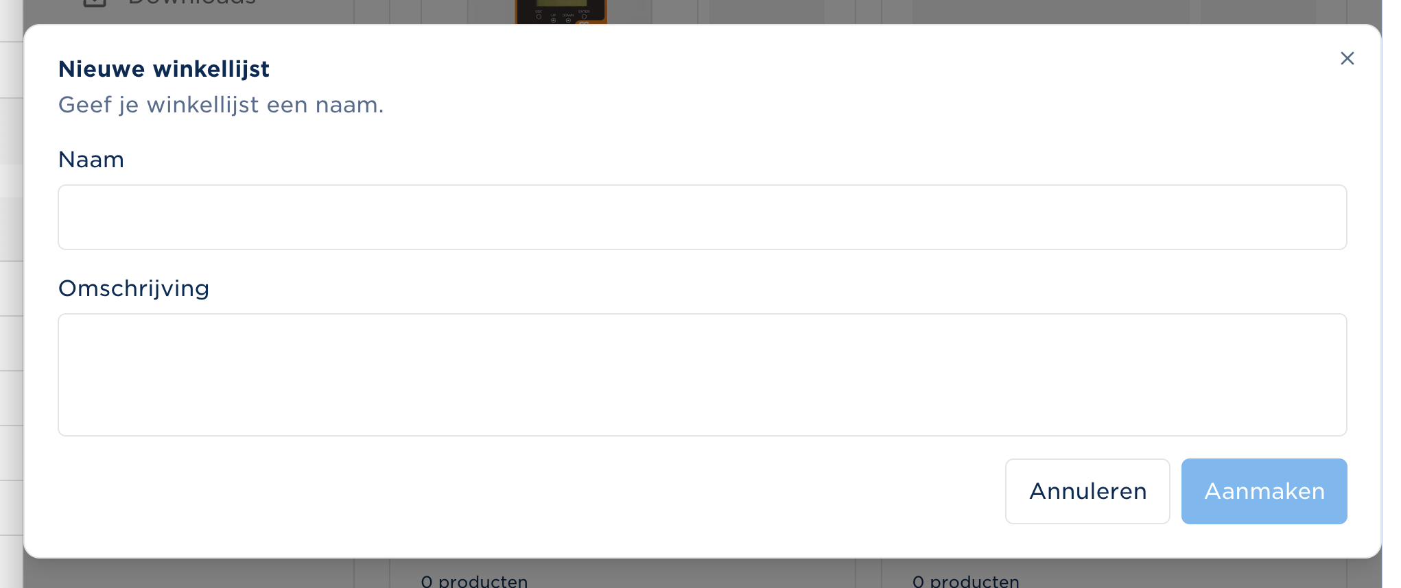
The second dialog is the same component. Only the token values changed.
Where your brand lives
Section titled “Where your brand lives”Your brand is one stylesheet that you own. In the reference sites it is
src/app/global.css, imported once by the root layout (src/app/layout.tsx):
import "./global.css";The stylesheet starts with Tailwind, then the styles.css of every Evolve package
you install:
@import "tailwindcss";@import "@evolve-storefront/ui/styles.css";@import "@evolve-storefront/commerce-ui/styles.css";@import "@evolve-storefront/layout/styles.css";@import "@evolve-storefront/feature-cart/styles.css";@import "@evolve-storefront/feature-order/styles.css";/* … one line per feature package you install */Each styles.css registers that package’s source with Tailwind (@source "./src").
Start from the default brand
Section titled “Start from the default brand”@evolve-storefront/ui ships the default Evolve brand as global.css. It is not a
package export, because your brand is yours to own. Copy its @theme block and its
[data-surface] rules into your stylesheet, then change the values:
cat node_modules/@evolve-storefront/ui/global.cssThe tokens
Section titled “The tokens”Set tokens in @theme, as plain values. Do not write var() aliases there: an
alias resolves once at :root, so you can never change it for a part of the page
later (see Change a token for one region).
Colors
Section titled “Colors”Color roles come in two tiers. Surface roles describe the plane a component sits on, and change together when the plane changes. Brand roles describe your actions and identity, and stay the same on every plane.
| Tier | Tokens |
|---|---|
| Surface | --color-background, --color-foreground, --color-muted, --color-muted-foreground, --color-border, --color-input, --color-ring, --color-highlight, --color-highlight-foreground |
| Brand | --color-primary, --color-secondary, --color-brand, --color-destructive, each with a -foreground |
A few roles need a word:
primaryis your action color: the main button.brandis your identity color: active navigation, sale ribbons, step indicators. Use it when your logo color differs from your button color.highlightis the hover and focus plane of secondary and tertiary buttons, menu items and select options.inputdraws the boundary of form controls.borderdraws dividers and card edges only.
@theme { --color-primary: hsl(240 5.9% 10%); --color-primary-foreground: hsl(0 0% 98%); /* The identity color. Dark text, because white on this orange is 2.99:1. */ --color-brand: #ff621f; --color-brand-foreground: hsl(240 10% 3.9%);}Radius
Section titled “Radius”| Token | Read by |
|---|---|
--radius-base |
Controls: buttons, inputs, textareas, select triggers, callouts |
--radius-sm, --radius-md, --radius-lg |
Surfaces such as cards and dialogs |
Control sizing
Section titled “Control sizing”--control-height, --control-padding-x and --control-font-size size buttons,
inputs, textareas and select triggers together. One declaration sizes a whole form,
and you can change it per breakpoint:
@media (width >= 48rem) { :root { --control-height: 3rem; --control-padding-x: 1.25rem; --control-font-size: 1rem; }}Components have no size prop. Size is a token, so it can change at a breakpoint
or in a region.
Spacing and layout
Section titled “Spacing and layout”| Token | What it sets | If you leave it out |
|---|---|---|
--flow-gap |
Gap between stacked children in dialogs, sheets and form fields | No gap |
--container-max, --container-padding |
Content width and page gutters of Container |
No max width, no gutters |
--sheet-width, --sheet-height |
Size of a Sheet panel. Set them on :root: the sheet renders outside your page tree |
The panel sizes to its content |
--detail-aside-width |
The summary column on cart, order and quote detail pages | 24rem |
--cart-summary-top |
Sticky offset of the cart summary | 1rem |
--content-block-gap |
Vertical rhythm between CMS content blocks | 3rem |
Only the last three have a fallback in the packages. The color, radius and control
tokens have no fallback either, so start from the default brand’s full @theme
and change values rather than writing a partial one.
Typography
Section titled “Typography”--font-sans is the font token. Evolve ships no type scale: Heading only turns a
level into an h1–h6 tag, with no classes. Style headings in your base layer,
or Tailwind’s reset leaves them at body size:
@layer base { h1 { @apply font-bold text-3xl md:text-4xl; } h2 { @apply font-bold text-2xl md:text-3xl; } h3 { @apply font-semibold text-xl md:text-2xl; } /* … h4 to h6 */}Load your font
Section titled “Load your font”The reference sites load a Google font with next/font and let it define
--font-sans:
-
Declare the font with
variable: "--font-sans":import { Archivo } from "next/font/google";export const archivo = Archivo({subsets: ["latin"],style: ["normal", "italic"],display: "swap",variable: "--font-sans",}); -
Put its class on
<html>, in the locale layout:<html lang={locale} className={cn(archivo.variable, "antialiased")}>
Put the class on <html>, not on <body>. Tailwind sets the page font on html
from --font-sans, so a value set lower in the tree has no effect.
Change a token for one region
Section titled “Change a token for one region”You can set a token on any element. Everything inside follows. The reference sites make every button a pill while form fields keep a small radius:
[data-component="button"] { --radius-base: 9999px;}Or give a checkout taller controls:
[data-component="checkout"] { --control-height: 2.75rem;}Every component carries a data-component attribute that names it. Write these
rules unlayered and without !important: package styles sit in Tailwind’s
components layer, so a plain rule of yours always wins. For more than tokens, see
Customize a component.
Surfaces and dark mode
Section titled “Surfaces and dark mode”A surface swaps the surface roles as a unit. Set data-surface on an element
and everything inside reads the colors of that plane. Surfaces nest:
<section data-surface="dark"> <Card>…</Card> {/* dark */} <div data-surface="base">…</div> {/* light again */}</section>The default brand defines [data-surface="base"] and [data-surface="dark"]. A
surface declares only the roles that differ, and inherits the rest. Override a
brand role there only when your color disappears on that plane. For example, a
near-black primary on a dark surface.
The content blocks’ hero sets data-surface="dark" when its text sits on a dark
image. Define a dark surface in your brand, or that text keeps your light-plane
colors.
Dark mode is not built in. To follow the operating system setting, add the dark values yourself:
@media (prefers-color-scheme: dark) { :root:not([data-surface]) { --color-background: oklch(0.145 0 0); --color-foreground: oklch(0.985 0 0); /* … the rest of your dark surface */ }}Check contrast
Section titled “Check contrast”Contrast depends on two colors, and both come from your brand. A component that
passes with the default brand can fail with yours. @evolve-storefront/ui/contrast
checks your stylesheet’s tokens without a browser.
-
Add the test. It needs
@evolve-storefront/commandsand@evolve-framework/cliin yourpackage.json:pnpm exec evolve add brand-contrastIf your CLI does not find the command, name the package:
pnpm exec evolve --package @evolve-storefront/commands add brand-contrast.It finds your stylesheet among
src/app/global.css,src/app/globals.css,app/global.css,app/globals.css,src/styles/global.cssandsrc/styles/globals.css. If it finds none or more than one, pass--stylesheet <path>. It keeps an existing test unless you pass--force. -
It writes
brand-contrast.test.tsnext to the stylesheet:import { fileURLToPath } from "node:url";import { checkBrandContrast } from "@evolve-storefront/ui/contrast";import { expect, it } from "vitest";// Contrast is a property of the brand's tokens, so a component's own tests cannot see it.it("the brand meets its contrast pairs", () => {const stylesheet = fileURLToPath(new URL("./global.css", import.meta.url));const failures = checkBrandContrast(stylesheet);expect(failures.map((failure) => failure.message)).toEqual([]);}); -
Run it with your Vitest suite. Make sure Vitest’s
includecoverssrc/app. It does not run under Playwright, becauseuiships TypeScript source.
A failure names the block, the pair and the ratio:
[data-surface="dark"]: --color-destructive-foreground on --color-destructive is 2.77:1, needs 4.5:1The check reads @theme and :root as the root, then checks every other block that
changes a color token (each surface, and your prefers-color-scheme block) with the
values it inherits. These are the pairs (CONTRAST_PAIRS):
| Pair | Minimum |
|---|---|
foreground and muted-foreground on background |
4.5:1 |
muted-foreground on muted |
4.5:1 |
primary, secondary, highlight, brand, destructive, each with its -foreground |
4.5:1 |
destructive on background (error text) |
4.5:1 |
input and ring on background |
3:1 |
Check muted-foreground on muted first. Badges and table headers put muted text
on a muted fill, and it is the pair that fails most often.
Pitfalls
Section titled “Pitfalls”- Do not redefine Tailwind’s container scale.
Dialogsizes itself withmax-w-lg, which reads--container-lg. If your theme repurposes--container-lgas a page width, dialogs become as wide as the page. Use--container-maxfor the page. - Do not set
heighton controls. Set--control-height. A component may switch tomin-heightlater, and yourheightwould then be wrong. --color-accentis gone. It was split intohighlight(hover plane) andbrand(identity). A leftover--color-accentdoes nothing.
- Customize a component: restyle one
component with
data-componentCSS when tokens are not enough. - Use your own icons: restyle the icons, or replace them with your brand’s set.
@evolve-storefront/uireference: every component and thedata-*state attributes you can style against.